Thursday 20 January 2011

How did you us media technologies in the construction and research, planning and evaluation stages? - Part 3

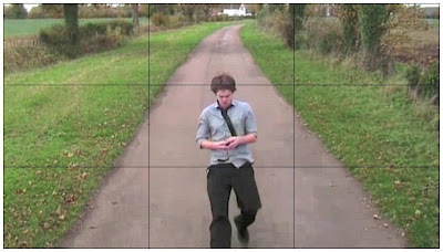
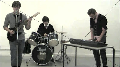
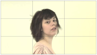
When shooting the production I was able to develop my skills that I have learnt during the making of my Foundation production where I learnt how to position the camera for a successful camera shot that would draw the audience’s eyes to the right part of the shot, considering the golden mean and the rule of thirds.

Rule of Thirds


Golden Mean


Rule of Third


As well as my shooting skills I have also been able to develop the skills used when editing the video, as the editing this time around had to be to the tempo of the music as well as the shots to be synced to the music when lip-syncing needs to be achieved.


When using the software on the Apple Mac’s such as iMovie and Photoshop I was able to develop skills that were developed by using the software using a trial and error technique to learn the software I was using. Although I never used Photoshop entirely to complete my final versions of the ancillary tasks, the background of the photo of the card used on the Magazine Advert was edited out on Photoshop but finished off in Adobe Fireworks. However I felt that I could achieve the effect I wanted on Picnik that I had previously used and was confident using for the completion of the Digipak.
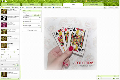

To edit the pictures for the Digipak the specific effects that I used were “Tint” which is a Colour affect and to make sure I have the right colour of white for the background so all of the Digipak panels had similar shades of white, and once together to make sure all panels fit together despite the slightly different shade of white I inserted a white matte effect to the image.

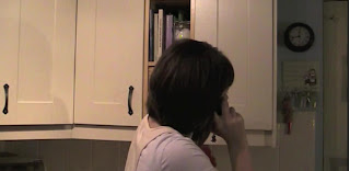
During the shooting and editing of the music video there were some technical issues that we came across. For example when filming the narrative clips from inside the house, extra lighting was required as the shots were poorly lit with the natural light available. This was easily overcome as we planned for extra lighting to be brought the setting, so this was used when the shot were too low lit. Also whist editing we came across a problem with the sound from the video footage as when we exported the completed video we become aware of some of the clips still having the background sound playing, and when making sure that all of the clips were muted, the sound still played. This has affected some of the performance scenes as the track we played during filming can be heard whist the clip is muted so we are unsure how it can still be heard. This wasn’t the easiest thing to overcome as the reason it was playing wasn’t because it wasn’t muted, as the clips were muted, so all the sound had to be detached from each clip then deleted to make sure none of the sound from the clips is present.

When the completed production is finished exhibiting them on online sites such as YouTube and Facebook is beneficial for receiving feedback from the audience, and as YouTube is widely accessible it is beneficial to get feedback from a large range of people that could be located anywhere in the world. Although Facebook also has similar benefits, unlike YouTube exhibiting it Facebook would only allow people that you are friends with to access the Video and provide feedback so YouTube would be the better place to exhibit the production as a simple link could be shared on the social network site Facebook to direct friends to the Video on YouTube thanks to technology enabling peoples online accounts on sites such as YouTube, Facebook, Blogger, Twitter and Hotmail to be linked.

How did you us media technologies in the construction and research, planning and evaluation stages? - Part 2


The videos that have given some inspiration are:
Kelly Clarkson – Never Again


Pink – Please Don’t Leave Me


Maroon 5 – This Love


As well as viewing professional music videos of a similar genre on YouTube I also came across a version of The Colours “Tonight I Let You Go” that was created by previous Media Studies students from a College I Nottingham. After watching it has enabled me to see how these Media students approached their production and I have been able to criticise their production in order to know what to look out for, making sure that I don’t make the same errors. Without the access of YouTube I wouldn’t have been provided with a previous production of the same song at the same amateur level to critique in order to help my approach to my production, as for example one error I felt would need addressing were the lighting issues there was with the performance shots so when approaching my own production the lighting was considered so we didn’t have the same error occur.


There has been a range of technologies that have been used when creating the production. One technology that has been used throughout the production is a blog on www.blogger.com where we are able to digitally document our findings and progress while constructing the production.

Other technologies that have been used are


Video Cameras: these were used when we were recording the footage for the music video, then this footage was imported straight to the Apple Macs for editing.

Cameras: these were used to take photographs for both ancillary tasks; the Digipak and the Magazine Advert.

Apple Mac + Software: We used an Apple Mac to edit our footage for our promo, with the use of iMovie and Final Cut Express. As well as editing the photo used on the magazine advert on Photoshop Elements.


The Internet: This was widely used to edit the pictures used in the ancillary tasks as well as locating the fonts used in these products too. The main sites used included: www.picnik.com, an online picture editing site where the images used in the Digipak were edited in addition to http://www.dafont.com/, an online collection of fonts where the fonts used in both ancillary task were sourced from. Whist other sites such as http://www.facebook.com/, http://www.youtube.com/ and http://www.tumblr.com/ were also used mainly I the audience feedback stages of the production, and to exhibition the promo we created.


Software: In addition to the software that was used on the Apple Macs I also made use of Adobe Fireworks which I used to add and position the text.

How did you us media technologies in the construction and research, planning and evaluation stages? - Part 1

Throughout the construction and research, planning and evaluation stages of the advanced production a range of media technologies were used. So we could overcome copyright issues which stopped us from using music from signed bands the website www.unsigned.com enabled us to search through unsigned bands, listen to their music, read a biography about them and it also provided the contact details of the band.


After searching through the possible song choices, I came across The Colours. With the contact details and band website being provided on their profile on www.unsigned.com it enabled us to research around the band using social network sites that are linked to from there band website and also enable us to contact them for permission to use their song. By using the web presence the band had on various social networking sites such as Facebook, MySpace and Twitter we were able to research and identify who the band were as well as the genre of songs they cover. It was possible to also contact the band via these sites however to ensure that we were coming across as professional as we don’t know the band we felt it would be more beneficial to email them to the email address they provide on their
www.unsigned.com profile.

The Colours web presence has helped us find out information about the band without having to contact the band and ask them about who they are. They have their own website as well as a presence on social networking which makes use of the new media technologies that are available in today’s world. [Make the point that new media allows unsigned bands to gain exposure without having a large budget like a signed band]
We were able to access information about the band via their Band Website, Unsigned, Facebook, Twitter and MySpace


YouTube is another media technology that I have made use of, as it has enabled me to research music videos that have been already created professionally for artist such as Maroon 5, Pink and Kelly Clarkson that cover the same genre as The Colours. By watching these music videos it enabled me to identify the common conventions that are used in videos doe this genre of song which gave me inspiration when producing my own music video which it comes to considering the camera work, editing, mise-en-scene and the representation of the band members and characters that may be in the video.

What have you learned from your audience feedback? - Part 2

To collect more feedback from the audience as the three comments that I received on YouTube didn’t give me enough information I posted a Questionnaire on Facebook and tagged my friends asking them to complete it if they have the time to. Using this method enabled me to get feedback on the exact parts of the products that I wanted feedback on such as the location shots, and the camera shots that we used in the music video. As I wanted at least 15 of these questionnaires collected I asked questions that required the audience to rate the elements as more people would willingly rate something out of ten then sit down and think about how to word their opinion on the element.


From this Audience Feedback we found out the people that we asked felt that our video fitted the song and all of the audience rated each area either 6,7,8,9 or 10, which is pretty positive feedback for the promo that we created. The audience also couldn’t think of any negatives for the Digipak Front cover which I asked for a Positive and Negative. We also contacted the Band hoping for their response however they still haven’t got back to us.

What have you learned from your audience feedback? - Part 1

When constructing our products the feedback we got from our audience research helped us during the production of these texts. We gathered the research by creating a questionnaire, that we asked people using face to face communication as well as via Social Networking sites such as Facebook and Tumblr. Both of these methods helped to gather the information that we required however the use of Facebook was a more useful as a questionnaire was about to be written as a note and people could be tagged, and unlike face to face communication it could be completed when its suits the user.

The questionnaire that we used to gather the information that we felt was necessary research contained questions surrounding the three products that we had to complete, enabling us to know what the audience looks for in the product, so we can meet the audience’s needs. This Audience research was a vital element to complete before constructing the final products, as we were able to find out what the audience prefers and looks for when it comes to these products, and from this questionnaire we found out that:

- More people would prefer a video that was 50% narrative based and 50% performance based, however the people who prefer to see more narrative in a music video think it should be spilt 70:30.

- People think that when the video contains narrative, the images should match the lyrics as it makes it more believable and think that it should reflect the song.

- All people I asked prefer the album cover to contain the band names and song title, however they feel that the band name is a more important feature of the album cover than the song title.

- People asked like to see an album cover that contain eye-catching artwork that relates to the song, which is easily identifiable with a good image with colour.

- Most people don’t take notice of magazine adverts about a band or artist and the ones that do only look at it if it is about a band they like, however the features that would attract them to a magazine advert are features such as a heading that stands out, a bright eye-catching image that attracts there glance.

Final research also had to be undertaken so we were able to find out the audience’s response on the completed products, this enabled us to learn whether we thoroughly researched around what the audience needs when it comes to a bands promotional package for an album release. One method I used to found out the audience’s response to our completed music video was to post it on YouTube and ask for any feedback, where I received 3 structured comments about the music video. As well as the comments I received on YouTube there was also 7 people that “liked” the video and 2 that disliked it, however the reasons behind the like and dislikes haven’t been provided.


As well as the feedback I received from these YouTube users, YouTube also provides insight statistics that provides information such as the audience that have watched the video, as well as how the user came across the video and the ratings of the video.

From these statistics that YouTube have provided, I have been able to establish who watched the music promo, and with the statistics about the audience that have watched the music promo I was able to verify that the audience that watched the video on YouTube matched the target audience that the promo was created for. These statistics have been quite beneficial when it comes to analysing who is watching the video and how they have got to the video, as we haven’t been able to get feedback from everybody that has watched the video.

How effective is the combination of your main product and your ancillary texts? - Part 1

Here are the three completed texts that we have provided for this production:


This is the completed version of the Digipak which follows the typical conventions of a Digipak with the use of Band/Artist pictures, Band/Artist logo, the Title of album, Barcode and Track listings. It also contains the Playing Card theme that is seen throughout all the three texts which would enable the audience to be able to easily identify that this a part of the bands release of the song. Also this Digipak contains both the band name and song title which is a feature that the audience we asked said they preferred, as well as the album cover containing artwork that is related to the title, eye-catching colourful image in addition to it being easy to identifiable which are the opinions of the features the audience we asked want to see on the front cover of the Digipak.

This is the completed version of our Magazine Advert, it follows the typical conventions of a Magazine advert as it contains the title of the album its advertising, the band/artists identify which is in a form of the logo and as well as a star rating from a reliable source, and in this case it is a popular Music Magazine. Although this Magazine advert does not follow all of the typical conventions of the text, the most important conventions are followed and the advert has been kept simple which is a more beneficial as it’ll attract more of the target audience as from the audience research I gathered that the audience are attracted by eye-catching picture with a heading that big and bold that instantly attracts attention.


The combination of all three products is quite effective due to the theme of playing cards that runs throughout them. However the strongest product is the Music Promo as there wasn’t as much group effort put into the Digipak and the Magazine Advert and they had been put at the bottom of the “To Do” list. Despite not having equal effort put into all of the products, I feel that the products as a whole do the intended job of being a promotional package for an album release due to how there is link between them this enables the audience associate this feature with the band’s album.


The link that appears in the product is the presence of Playing Cards, which were chosen as a feature to have in all three products when we thought that a Queen of Hearts could represent the female in the song while the Band members could be represented by the Jack of Diamonds, Spades and Clubs. So in every product cards are featured, which gives that an association with the particular album release. While other ideas that were mainly used in the promo were attained when the lyrics were inputted and adapted to a Wordle (which can be seen below) so instead of defining the lyrics as a whole we defined the most common words that appeared in the song to get a more in depth deconstruction as i was able to define the words that have been used frequently throughout the song and then put then into the context of the song.

To promote the band’s album release these materials would need to be exhibited and this could be efficiently done using traditional media as well as new media. The traditional methods of exhibiting these promotional products would be shown on music channels that cater for the similar genre of music, in a Music Magazine as well as in record store where the Digipak could be purchased. I feel that out of the possible music channels that are available, I feel that 4Music is the best channel for my Music Promo to be shown on because the channel is available to a bigger audience as it is available for Free view viewers as well as Sky and Virgin Media viewers with an audience share of 0.3%, as well as it being a well known channel that is advertised over its sister channels; Channel 4, E4, More 4 and Film 4. The channel also caters for the Pop Rock genre of song as some channels only cater for specific genres such as Heavy Metal. Whereas the music magazine that I feel would be most suitable to publish my Magazine Advert would by New Musical Express (NME).


However it would bring more advantages if the promotional products were exhibited using new media as well as the traditional methods as it would heighten the audience and be more widely available as with methods such as Facebook, YouTube and iTunes which offer services that are available 24 hours a day, 7 days a week at the users leisure, it would benefit when it comes to exhibiting these promotional products, in additional to the availability of individuals being about to upload, blog and re-blog which is a beneficial way that this texts can circulate around its target audience

In what ways does your media product use, develop or challenge forms and conventions of real media products? - Part 4

One element that have to be considered when planning were the location our performance and narrative shots. As we needed to film in a house, a pub, a country road and access to a small river for the narrative shots we felt it would be beneficial to travel to Haconby, Bourne as we could access all three places in this village.


The first location is the marital house which is one of our actor’s homes, we decided that this house would be a good location for our house shots as it is tidy and fairly rural styled inside which will fit stylistically with the pub location as well as the running scenes through country lanes. The kitchen, hall, and bedroom will all be used, and the only issue that we felt we might have with this location, was an issue with the lighting due to the dark walls, however with an extra desk lamp we were able to solve this problem by lighting up the shot with the desk lamp. Typically the houses that are used in music promos tend to be big houses with spacious rooms and expensive furnishings however this was difficult to scout, and as we were using a rustic pub and country roads a rural styled house would fit in better than the typical house that we see in promos.


The second location we used was a country road leading out of Haconby and as it was a back road and not the main road out of Haconby we were able to film the shots we needed from the middle of the road without having cars having to go by. We also decided to choose this location as we needed to locate a small river for the shots were the phone gets dropped in the river and this location is also able to provide a small river further down the country road.


The final location we chose for the shooting of the narrative shots were the village’s pub, The Hare and Hounds and this was the only location that we had to seek permission for, however the bar owner was happy for us to shot our poker scene that we have planned. This location was chosen mainly because it was located in a quiet village so we thought that it wouldn’t be that busy so we would be able to film, whist if we was to film in a pub in a town it would have been harder as we would have to control the background of what was in the shot as well as the particular shot in the foreground we wanted.


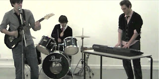
For the performance location so we followed the typical performance shot location we felt it was necessary to film the shots in an enclosed empty space, which had either a plain black or a plain white background so we could follow the characteristic conventions for performance shots as well as having a plain colour that doesn’t denote any emotion that could be linked with love such as a colour in the red colour palette. These performance shots are important to the music video as it gives the audience access to the band performing which they wouldn’t be able to get anywhere else.


In music video the right ‘image’ had to be created for the costume for the actors was somewhat important. I felt as the costume was important as it had to think about, so the right image could be portrayed. By looking at the pictures available of The Colours I felt it was necessary to use the image they have already created for themselves as an unsigned band. They seems to have a smart casual look, so I searched through the shirts, ties, blazers, t-shirts, belts and coats that were available from local high street stores that fitted the image we wanted to portray. The clothes below show the type of costume that I felt was required for the music video, however when filming we wanted to make use of the actors own clothes if they are owned anything similar that also fitted the look we wanted to portray.


After researching around how narrative and performance are used in music promos of the Pop Rock genre I was able to compare how narrative and performance is used in this genre than other genres. Before editing our promo together we decided to have the ratio of narrative to performance as 60:40 as that was the typical ratio I saw in other videos that were the same genre, however while editing it ended up a bit more balanced although this still fitted the genre. For the performance shots it showed all three band members performing in a close proximity which enables the audience to get close to their band playing which wouldn’t be possible unless they got front row tickets at their gig. This makes the band organic, and it is necessary that in the performance shots although mining they give a convincing performance. Also with the use of a narrative has given the audience something to follow and the story the narrative has helps give the video it’s unique selling point and it also helps with the repeatability of the video which is vital for the promo.

Wednesday 19 January 2011

In what ways does your media product use, develop or challenge forms and conventions of real media products? - Part 3

In addition to the current music promos that influenced us with our own promo, there were also other media that we took influence from for our Digipak in addition to our Magazine Advert.

The typical conventions of a Digipak are:
- Image of the Band/Artist
- Band/Artist Logo
- Band/Artist Name
- Record Company Logo
- Music Industry Logo
- CD/DVD Logo
- Barcode
- Track Listing on Reverse
- Reviews
- Credits
- Band/Artist Web Address
- Explicit Warning Logo (depending whether it’s necessary for the songs on CD/DVD)
-

Whereas for a magazine advert although they have similar conventions such as a band/artist image and logo however there are some additional conventions that are used in a Music magazine advert and not in a Digipak seems the advert is to publicise the song release.

The typical conventions of a Music Magazine Advert are:
- Record label
- Band/Artist identify
- Title
- Tour dates
- Price of CD
- Release date of the CD
- Band/Artist website
- Quote from other sources
- Pictures of the Band/Artist
- Star rating


For our ancillary task we simply took inspiration from a pack of playing cards which then took us to the James Bond Casino Royale opening credits which we took some influence from.


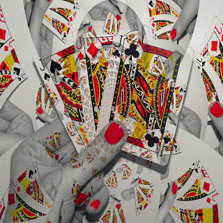
Although we were inspired by the moving figures, we took influence from the positioning of the cards, and this can be seen in the first ideas we had for the Digipak covers, although from this first ideas we told more influence from images that contain people’s hands holding a hand of cards, and then we felt the three band member could be represented by the three Jacks, from the club, spade and diamond suit, while the women that is mentioned is the song could be represented as the Queen of Hearts. These pictures below helped influence us when it came to presenting the idea of three jacks representing the three band members, as it would be an iconic image to have as a front cover of a Digipak

In what ways does your media product use, develop or challenge forms and conventions of real media products? - Part 2

There has been a range of promos and other media that have influenced our work, the current promos that have influenced us are:

Kelly Clarkson “Never Again” - http://www.youtube.com/watch?v=XDvePB2Gz7o&ob=av2e


From this music promo I was influenced by the shots where Kelly Clarkson was getting into the males personal space and looks as if she is seducing him whist he has no reaction to her actions and she was aggressively singing with a plain black background. I liked how it was a plain monochrome colour background and as we only had access to white walls we were able to use these. And I was also influenced with the attempt of seduction, however it was for a different reason than the Never Again promo but I felt it would work, with the woman trying to charm the man back into her arms, but fails. I felt it would be beneficial to have the women attempting to charm the man as It would appear at the beginning and set the scene as the audience is aware that the man is at wanting to let the women go, which links to the song’s lyrics, and throughout the narrative we see why the man would want to let the women go.


I was also influenced by the performance shots that were used in this promo as it was performed with a pure white background and the entire band are wearing white which helped with the heartbreak message the song has, due the use of white and there not being an emotion that is clearly linked to the colour. And when applying this influence to my own promo, I felt it would be beneficial to have the white background however as I was trying to make sure the band had the “right” image I felt it was necessary for them to have the black, white, grey and red colour scheme with their clothing throughout both performance and narrative shots. This is as the black/white/grey colours are all colours in the monochrome palette and the hint of red helps relate the clothing to the theme that appears throughout the three texts, which are playing cards seems the main colours we see in a typical pack of cards is white, black and red.

Pink “Please Don’t Leave Me” -
http://www.youtube.com/watch?v=aH1IE8R-P9o&ob=av3e


The element from this promo that I was influenced by were the fade shots that appear at the beginning of the promo, which help set the scene of the video as it shows the house from the outside, a shot from the hallway inside the house, and a upstairs room in the house were people are located, all are put together with black fades instead of the typical straight cuts that are used throughout music promos. I felt this was a good effect as the transition to the next shot weren’t as harsh as it would have been with the straight cuts through these beginning shots, and the fades also fit with the tempo of the song, also this is a quite unconventional way of using fade shots as they give the impression of flash backs or something back into someone’s memory. Conveniently the beginning of my chosen song had beat that would benefit from the use of fade shots and it would enable me to set the scene of the video with shots of the female seducing a man trying to get his attention but not succeeding. However the main influence from this promo was the fade to black shots, which were also used in my own music promo

Maroon 5 “This Love” - http://www.youtube.com/watch?v=XPpTgCho5ZA&ob=av2n


An element I was influenced by from this promo were the location of the performance shots, as the location is a courtyard is quite isolated which is typical feature when it comes to band performance shots as well as using a plain colour background which is a reddish orange which could easily have a link to love, which is conveyed in the song. They make use of nature with the blossom trees that could be seen as significant symbol of power. Typically it represents a feminine beauty and sexuality and often holds an idea of power or feminine dominance. And another element that I was influenced was from the same shots were the positioning of the band which helped when figuring out the positioning of the band members when filming my own music promo. Although I got influenced by the plain colour background and it having a link to emotions as well as the use of natural to help signify things such as emotions, however I felt this would be difficult to pull off successfully.


I was also influenced in how this promo put together its sex scene with a range of camera shots, put together to the tempo of the song. As well as the positioning of the camera giving the audience the effect of invading their privacy and getting into their personal space as we are brought a little close to the action, which is also known as voyeurism which is a common convention used in music videos. However due to the nature of my promo this would have to be toned down a lot and be covered and only be implied, however from the sex scene I was mostly influenced by the camera positioning because the shot was thoughtfully angled and creates a sense of voyeurism for the viewer so when it comes to filming the scene in our own promo the camera positioning will have to be considered

Sandi Thom “I Wish I Was a Punk Rocker” - http://www.youtube.com/watch?v=vc2jDz6w-r4

The element I was influenced by from this music promo was the feature of the singer travelling towards to camera, although this feature was used throughout the promo I felt this would be a good element to use as a shot for our own promo, however adapting the element to the singer running towards the camera, and not staying the same distance away from the camera throughout the shot.

Maroon 5 “She Will Be Loved” -
http://www.youtube.com/watch?v=nIjVuRTm-dc&ob=av2e


Once watched this music promo, we were influenced by the way the female was represented in the video through the use of costume, facial expressions, body language and props. So to mimic this effect we felt it was necessary for the female character in the promo to wear clothing from the red/pink colour palette with make-up to compliment. By using these colours we felt it would help represent the female as once the female in the Maroon 5 promo we can associate the red dress with feelings of love as well as danger, so we felt it was necessary for the female to be represented in a way that meanings can be denoted from the way they look.

Mumford and Sons “Little Lion Man” -
http://www.youtube.com/watch?v=lLJf9qJHR3E

The element from this promo that we were influence by were the use of close up shots of the band member playing their instruments as well as the whole band shots, these shots are a successful convention in pop promos which are commonly used to give the viewer a close up view of the band performing which they wouldn’t get unless they attended the bands concert and were located in the front row. We felt Mumford and Sons promo for Little Lion Man used this typical convention effectively so we took notice of how the shots were angled so we could attempt to get the same effective shots of our band playing to use in our own promo.
My music promo followed a range of typical conventions of a video in the same Pop Rock genre such as the use of band shots, whole band shot and performance clips, the use of Close Up shots (CU), straight cuts, panning, deserted locations, fast-pace editing cut to the tempo of the song, voyeurism and singing whist acting in the narrative scenes. Whilst we have also broke some kept to some conventions, and we never just used straight cuts as we felt the use of fade shots would be more effective as it would create a fade back effect. Which we felt was necessary.

In what ways does your media product use, develop or challenge forms and conventions of real media products? - Part 1

Our brief was to create a music video promo for a song sung by an unsigned band, as well as a CD/DVD Digipak to house the CD and a Magazine Advert to promote the single release. For this production I had chosen to create these materials for The Colours and their single “Tonight I Let You Go”, a song which is in the Pop Rock genre from an unsigned band from Reading.

The purpose of these texts is as follows:

Music Video: To entertain and help sell the record, as well as giving the audience access to the band and a better understanding of the song.


Digipak: To house and protect a single CD that an artist/band is releasing, in addiction to more importantly to be targeted to attract the target audience to purchase their music.


Magazine Advert: To publicise the song release as well as advertising the artist/band to its target audience.


There are many elements that are used that make a music promo, the following elements are what we could expect to see in a music promo, however some would depend on the genre of the song:
Some of these elements would be dependent on the genre of the song as not all genres utilise these elements as they don’t have any relationship with the song.

The typical conventions used in a music video of this genre are:
- Band Shots, whole band shots and performance clips
- High lighting
- Bright lighting - not natural
- Close-ups and extreme close-ups
- Colour effects, often monochrome
- Fast-pace editing
- Straight cuts
- Panning
- Seductive pose from the female artists
- Deserted locations with straight forward narrative
- Guitar solos
- Voyeurism
- Urban locations
- Singing whist act

In the majority of music videos of a similar genre there commonly links between the lyrics of the song and the video in the narrative parts of the video. So before planning the video possible links had to be identified, so this conventional link between the lyrics and video could be made. You can see below how we deconstructed the lyrics of our chosen song to benefit us when planning the narrative scenes for our video.

Monday 17 January 2011

Final Design of Digipak


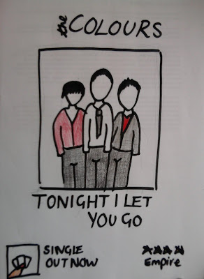
This is the completed version of the Digipak which follows the typical conventions of a Digipak with the use of Band/Artist pictures, Band/Artist logo, the Title of album, Barcode and Track listings. It also contains the Playing Card theme that is seen throughout all the three texts which would enable the audience to be able to easily identify that this a part of the bands release of the song. Also this Digipak contains both the band name and song title which is a feature that the audience we asked said they preferred, as well as the album cover containing artwork that is related to the title, eye-catching colourful image in addition to it being easy to identifiable which are the opinions of the features the audience we asked want to see on the front cover of the Digipak.

Final Design of Magazine Advert


This is the completed version of our Magazine Advert, it follows the typical conventions of a Magazine advert as it contains the title of the album its advertising, the band/artists identify which is in a form of the logo and as well as a star rating from a reliable source, and in this case it is a popular Music Magazine. Although this Magazine advert does not follow all of the typical conventions of the text, the most important conventions are followed and the advert has been kept simple which is a more beneficial as it’ll attract more of the target audience as from the audience research I gathered that the audience are attracted by eye-catching picture with a heading that big and bold that instantly attracts attention.

Friday 7 January 2011

Theories in Media - Part 2

Andrew Goodwin: Music videos demonstrate genre characteristics (e.g. stage performance in a heavy metal video, dance routine for boy/girl band). The demands of the record label will include the need for lots of close-ups of the artist and the artist may develop themes which recur across their work. There is frequently reference to the notion of looking and particularly voyeuristic treatment of the female body. There is often intertextual reference to other media such as films TV programmes as well as other music videos.

Steve Archer: There needs to be a strong and logical relationship between the narrative and performance in music promos. Music videos will cut between a narrative and a performance of the song by the band. A carefully choreographed dance might be part of the artist’s performance or an extra aspect of the video designed to aid visualisation and the ‘repeatability’ factor of the music video.
John Stewart: A music video has the visuals of a TV commercial, with lots of close-ups and lighting being used to focus on the star’s face. Visual references come from a range of sources, such as cinema, fashion and art photography. ‘Incorporating, raiding and reconstructing’ is essentially the core of Intertextuality, using something with which the audience may be familiar, to generate both regretful associations and new meanings. The video allows more access to the performer than a stage performance can due to the close-up shots that are used. Mise-en-scene can be used to emphasise a desired lifestyle.

Sigmund Freud: Voyeurism referring to the notion that erotic pleasure may be gained by looking at a sexual object, preferably when the object is unaware of being watched. (This can be seen in the music video Rio by Duran Duran)

Laura Mulvevy: Because filmmakers are predominantly male, the presence of women in films is often solely for the purposes of display rather than for narrative purposes. The purpose of this display is to assist a voyeuristic response in spectators, which presumes a ‘male gaze’ one that is a powerful controlling gaze at the female on display, who is effectively objectified and passive.

Thursday 6 January 2011

Theories in Media - Part 1

There are a range of theories in media; some are just general theories that explore the theories of Lyrics, Genre, Camerawork, Editing, Intertextuality and Exhibitionism. As well as peoples own theories surrounding there own views on the topic.

Lyrics: Establish a general feeling/mood/sense of subject rather than a meaning.

Music: Tempo often drives the editing.

Genre: Reflected in types of Mise-en-scene, themes, performance, camera and editing styles

Camerawork: Has an impact of the meaning. Movement, angle and shot distance all play a part in the representation of the artist/band (close-ups dominate)

Editing: the most common form of fast-cut montage images impossible to grasp on first viewing, ensures multiple viewing. Editing using digital effects, which play with the original images to other different kinds of pleasure for the audience.

Intertextuality expresses that not all of the audience will be able to spot the reference however this wouldn’t detract from their pleasure in the text itself although the audience that recognise the reference would get more pleasure out of the text due to recognise this link to another text. It would also increase the audience’s engagement with the product, and many music videos raw upon cinema and other areas in popular culture.

Exhibitionism explains that the apparently more powerful independent female artists of recent years have added to the complexity of the politics of looking and gender/cultural debates, by being at once sexually provocative and apparently in control of and invited a sexualised gaze upon themselves.

Saturday 25 December 2010

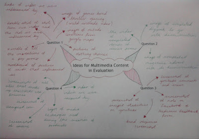
Ideas for Multimedia Content in Evaluation

As the Evaluation that needs to be completed requires Multimedia content such as Images, Graphs, Videos and links to sites on the World Wide Web to make sure there is beneficial multimedia content throughout the Evaluation I have had a brainstorm of all the ideal content for each of the Evaluation questions as then it would help ensure that the Evaluation is making use of multimedia and isn’t just paragraphs of text.


Friday 10 December 2010

Final Design for Digipak Cover


Idea for Design of Magazine Advert

As the magazine advert hasn’t been properly thought about yet, I make my group take time out from starting the evaluation to all get a general idea of how we want our magazine advert to look like, we have came up with a simple but effective idea that would attract the target audience of the band.
.

Thursday 9 December 2010

Completion of the Music Video

Here is the First Copy of our Music Video:


This is the first copy of our completed Music Video as after uploading it to YouTube I noticed that some of the clips haven’t been muted in the narrative and the performance. I felt this needed changing before burning it to the final disc to be handed in due it to being sound which was out of place in the video; the only sound that we felt needed to in the video was the key dropping. However in this version there are many unmated clips that we thought were muted such as the clip where I am calling Kieran as Chris was mimicking a telephone dial which can be heard.


As well as performance shots that have the track playing from when filming it, as we were playing the track in the drama studio from a CD player, and as it was a drama studio suddenly there is clip with the song echoing which isn't what we wanted to be unmuted.

Slow Progress of Digipak

The Digipak has been a task that has been going on for a while, and is making slow progress, and its the front cover which has made the no progress, although I have established which image will be used as it has come to the text I find this the more difficult part as there are many fonts that could be used, however finding the right font and also placing it on the Digipak Cover is proving difficult.

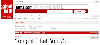
I think I have finally found the font that could be used for the song title as it is the same font as the lettering that is found on playing cards and as we have made the connection between the song and the playing cards I feel it would be the right font to use. I found the font on dafont.com which has many fonts that are there for users to download for personal use. The font I have chosen for the song title is titled Slab Tall X” and is available to download for free from dafont.com.

I now have to identify the right font for the band name, but this would also be a band name/logo that the audience identify the band by. So it has to be artistic and need to link to the band more than the song as the graphic would be used for all of the bands Albums, and no just for this album of “Tonight I Let You Go”.

Tuesday 7 December 2010

The Progress of the Digipak

When designing the Digipak I feel that the most important thing to get right is the front cover due it being the part of the CD that the audience sees first. So taken it into consideration I have been going through different edits to create the perfect front cover than will match the other shots for the Digipak to the front cover so the theme runs throughout.

For the front cover these are how it has developed (please note: the text hasn't been added yet to all front cover attempt and will be added when the final design as been created and agreed):

Attempt 1:
Although I hate this Attempt I felt it was necessary to include it to show the development of the Idea. There are many reasons I dislike this design such as the colours being too bright and the picture appearing in the background is too bold, and would need to be faded in more, which I then did the other attempts I created.


Attempt 2:

Attempt 3:


Attempt 4:

Attempt 5:
This is the only attempt that I decided to add text to while in Picnik, although the text works I’m not sure about the font and think there could be a better font for the band name which would also work as the band logo, and then the song title.
.

Attempt 6:
With this attempt I played around with the colour to see what the effects would create although it looks okay, and could be a Digipak cover I don’t feel it has that wow factor which is needed for our Digipak cover.
.
Attempt 7:
This attempt is the same colouring as the next attempt but without the picture appearing in the background, there is a white vignette applied which I feel gives a good affect the Digipak cover, also I like how the colour stands out from the white background and the text when included would stand out due to it appearing on the white background.
.

Attempt 8:
This is the attempt I feel would be the best to use for the Digipak, because it is pure white, which matches the colour background of the performance shots in the video as well as looks abstract with the picture appearing faint in the background which I feel gives more of an effect than Attempt 7 which is the same edit without the picture being put into the background.

As I feel this Attempt will go on and be the Digipak front cover the text font for “Tonight I Let You Go” and “theCOLOURS” needs to be found and added to the CD cover, and all the other panels of the Digipak should be edited to match this, so there is an overall theme going through the Digipak.


All of these images were edited on Picnik, a online photo editing site that I have used frequently in the past to edit my own photos, there are many effects that could be applied and as I was comfortable with the editing software I decided to use it rather than Photoshop which we had access to on the Mac’s we were editing on.

The next task is to get the correct font and add the text to the front of the Digipak, the text will be added to the cover in Adobe Fireworks, which is software I know how to operate due to having used it before and I am comfortable in using it.