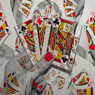
For the front cover these are how it has developed (please note: the text hasn't been added yet to all front cover attempt and will be added when the final design as been created and agreed):
Attempt 1:
Although I hate this Attempt I felt it was necessary to include it to show the development of the Idea. There are many reasons I dislike this design such as the colours being too bright and the picture appearing in the background is too bold, and would need to be faded in more, which I then did the other attempts I created.

Attempt 2:

Attempt 3:

Attempt 4:
This is the only attempt that I decided to add text to while in Picnik, although the text works I’m not sure about the font and think there could be a better font for the band name which would also work as the band logo, and then the song title.
.
With this attempt I played around with the colour to see what the effects would create although it looks okay, and could be a Digipak cover I don’t feel it has that wow factor which is needed for our Digipak cover.
.
Attempt 7:
This attempt is the same colouring as the next attempt but without the picture appearing in the background, there is a white vignette applied which I feel gives a good affect the Digipak cover, also I like how the colour stands out from the white background and the text when included would stand out due to it appearing on the white background.
.

Attempt 8:
This is the attempt I feel would be the best to use for the Digipak, because it is pure white, which matches the colour background of the performance shots in the video as well as looks abstract with the picture appearing faint in the background which I feel gives more of an effect than Attempt 7 which is the same edit without the picture being put into the background.
As I feel this Attempt will go on and be the Digipak front cover the text font for “Tonight I Let You Go” and “theCOLOURS” needs to be found and added to the CD cover, and all the other panels of the Digipak should be edited to match this, so there is an overall theme going through the Digipak.
As I feel this Attempt will go on and be the Digipak front cover the text font for “Tonight I Let You Go” and “theCOLOURS” needs to be found and added to the CD cover, and all the other panels of the Digipak should be edited to match this, so there is an overall theme going through the Digipak.
All of these images were edited on Picnik, a online photo editing site that I have used frequently in the past to edit my own photos, there are many effects that could be applied and as I was comfortable with the editing software I decided to use it rather than Photoshop which we had access to on the Mac’s we were editing on.
The next task is to get the correct font and add the text to the front of the Digipak, the text will be added to the cover in Adobe Fireworks, which is software I know how to operate due to having used it before and I am comfortable in using it.


No comments:
Post a Comment